Project overview
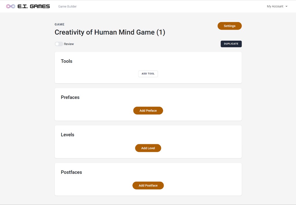
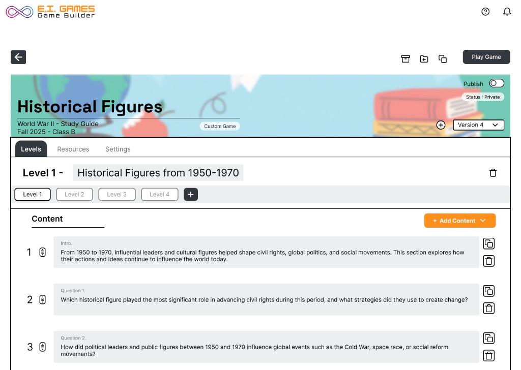
I worked with E.I. Games on remaking their game builder—the tool teachers use to assemble gamified learning experiences. The goal was a more intuitive layout so educators could find levels, add content, and understand publish status without second-guessing where to click.
What I focused on
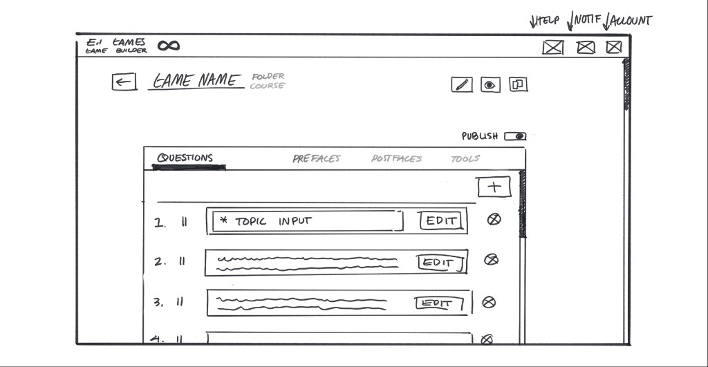
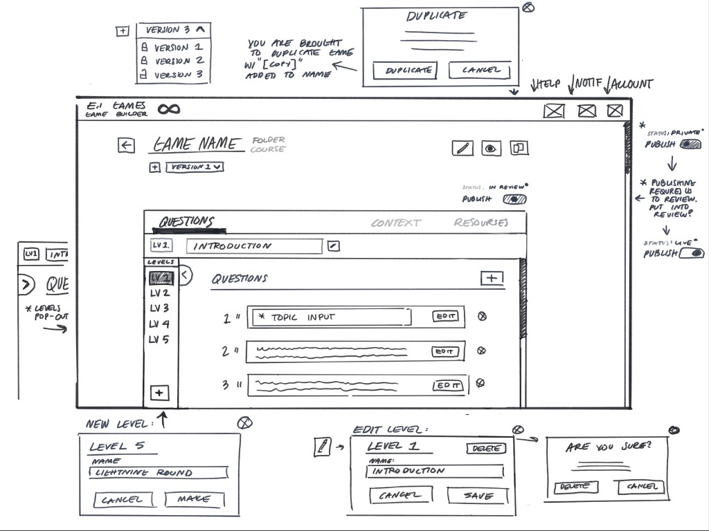
- Mapping how teachers move between game shell, levels, and individual content blocks
- Wireframes for tabs, sidebars, and modals (publish, duplicate, new level)
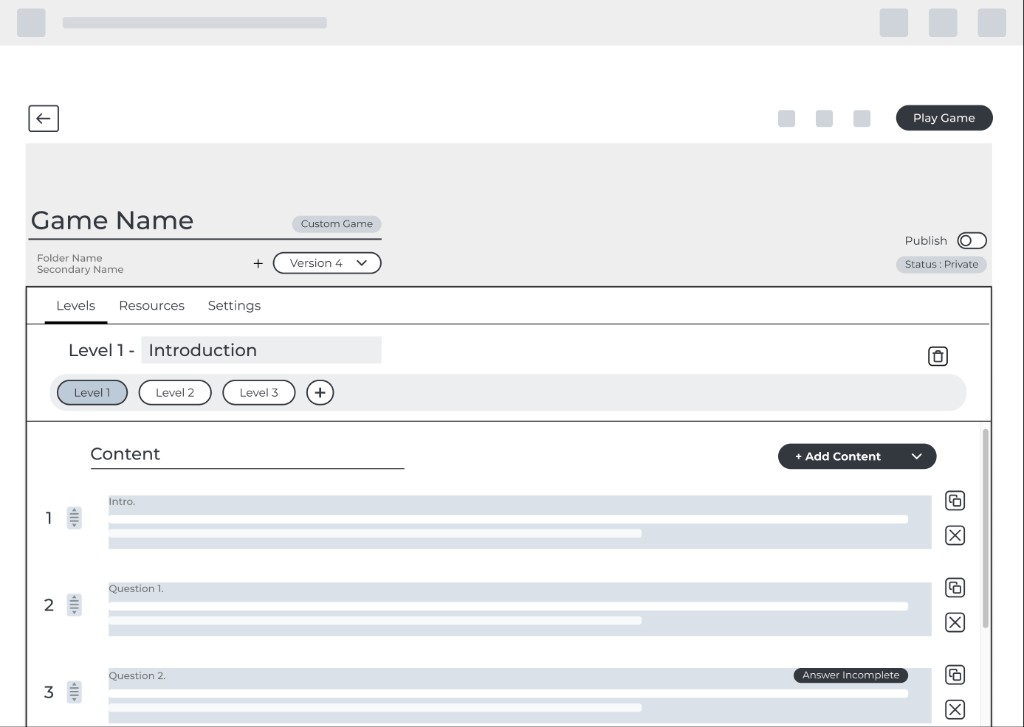
- Iterating toward a calmer editor UI with clearer primary and secondary actions
- Aligning patterns with real classroom workflows—not just desktop patterns copied from other products
Outcomes
The redesign direction reduces cognitive load on dense screens: level selection, content lists, and status (private / review / live) read as one story instead of three disconnected areas.
Collaboration
I stayed in close sync with stakeholders while wireframing and mocking UI so tradeoffs around scope, engineering effort, and teacher habits stayed visible early—not only at handoff.
Reflection
EdTech tools have to work for people who are interrupted constantly. Patterns that feel “standard” elsewhere still need validation when the user is managing a room of kids and a timer at the same time.